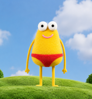
Hi, I'm Daria — a graphic designer focused on branding and visual identity.
Since 2024 I've been working freelance, mostly on logo design and full brand systems: logobooks, guidelines, packaging concepts, and the visuals that hold a brand together. I also animate logos and put together short motion pieces in After Effects, design Instagram content, and build layouts and presentations in Figma.
Right now I'm designing my own typeface, just for the challenge of it.
Day to day I work across Adobe Creative Suite, Figma, and FontLab, and I like folding AI tools into my process too — for moodboards, ideation, or just talking through an idea before it becomes a design.
Also studying graphic design at Lviv National Academy of Arts, in case that matters to you.
Akademia Gracia
CONCEPT
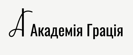
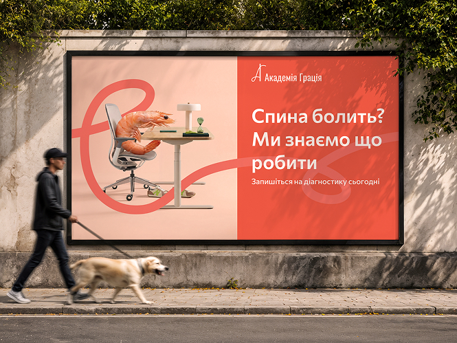
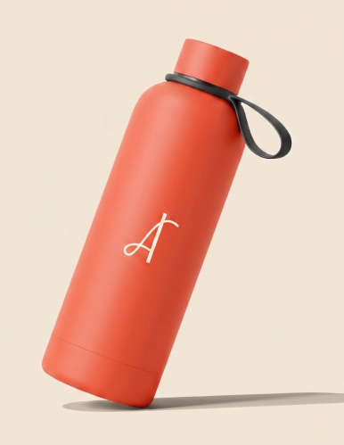
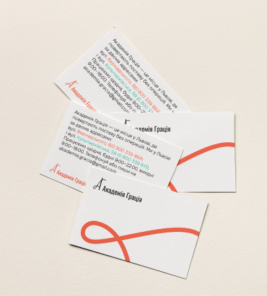
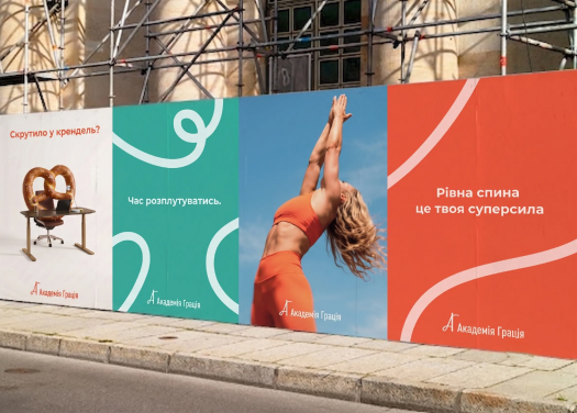
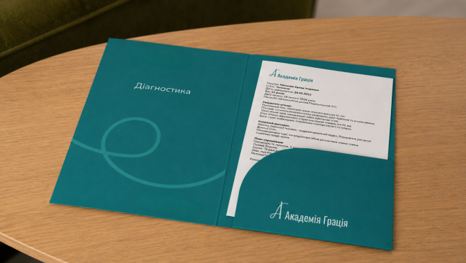
Akademia Gracia is a rehabilitation center in Lviv with 35 years of history, specializing in non-surgical correction of posture and scoliosis for children and adults. The brand had outgrown its old identity — pink, cluttered, and closer to a beauty salon than a center of medical expertise.
CHALLENGE
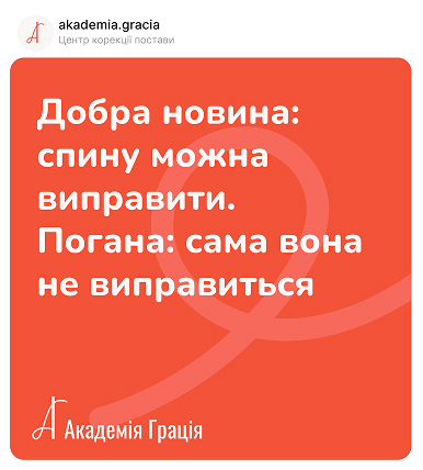
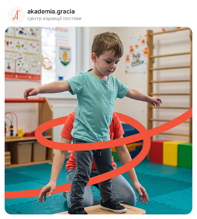
Balance scientific credibility with human warmth — without looking clinical or childish. The visual language needed to speak to both worried parents and adults living with chronic pain, with honesty and without fear.
SOLUTION
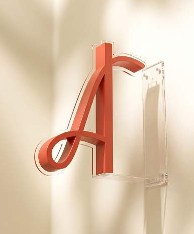
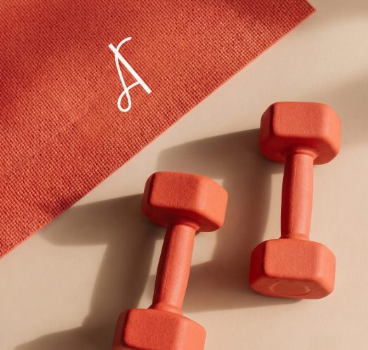
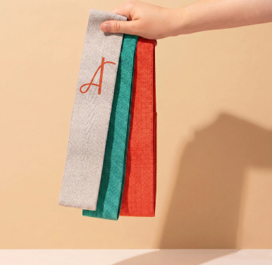
The identity is built around a custom monogram of the letter "A" — a thick vertical stroke for structure and posture, paired with a thin calligraphic curve for movement and grace. A warm palette of coral and teal replaces the old aggressive pink, paired with a friendly, honest tone of voice across all communication.

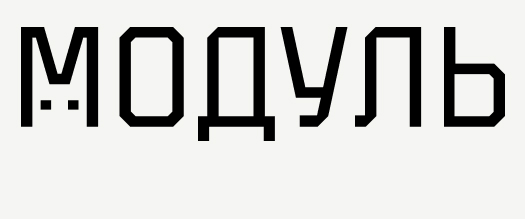
Module

CONCEPT
Module is a minimalist coffee spot designed for people who work from their laptop — a "third place" between home and office. A quiet, focused space where specialty coffee meets productivity, inspired by industrial aesthetics: concrete, steel, and open space that helps visitors stay in the flow.
CHALLENGE
The brand is built on a geometric grid and technical precision. A stylized rabbit mascot is integrated into the letter "M," adding personality to the strict modular system — symbolizing agility and mental focus, mirroring the people who come here to create and work.
SOLUTION
Neutral industrial grays combine with a bright Electric Blue, creating a look that's modern, energetic, and grounded at the same time. A palette built to feel both calm enough to focus in, and sharp enough to stand out.


Mescla
CONCEPT
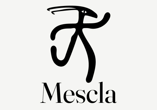
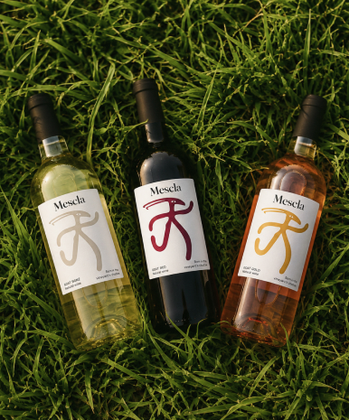
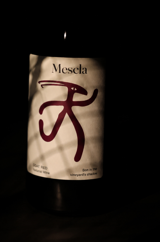
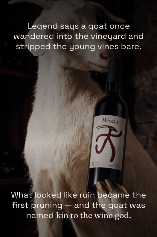
Mescla, derived from the Italian word for "mixture," is a natural wine brand built around a strange and vivid myth: a goat once wandered into a vineyard, stripped the young vines bare — and by accident, taught winemakers the art of pruning.
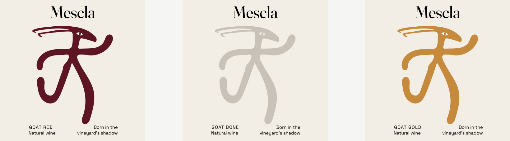
The brand's mark merges human and goat into a single wild figure, "kin to the wine god" himself — leaning into the raw, untamed character of natural wine: unfiltered, unpolished, and true to instinct.
CHALLENGE
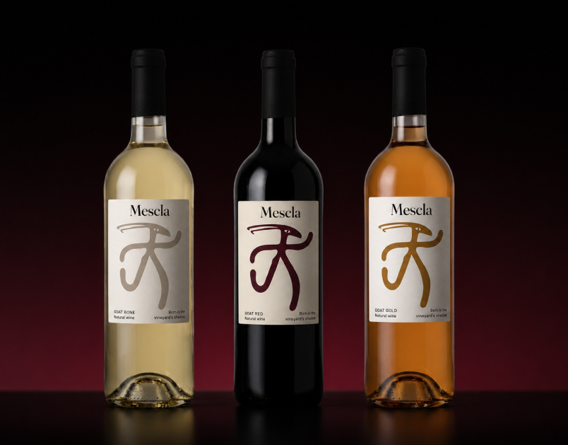
Giving a surreal, mythological figure enough restraint to still function as a wine label — not as an illustration, but as a mark that could scale across three different wine variants without losing legibility. Balancing the wild, expressive linework of the goat-human figure with a calm, editorial typography system (Fraunces) was key to keeping the brand feeling intentional rather than chaotic.
SOLUTION
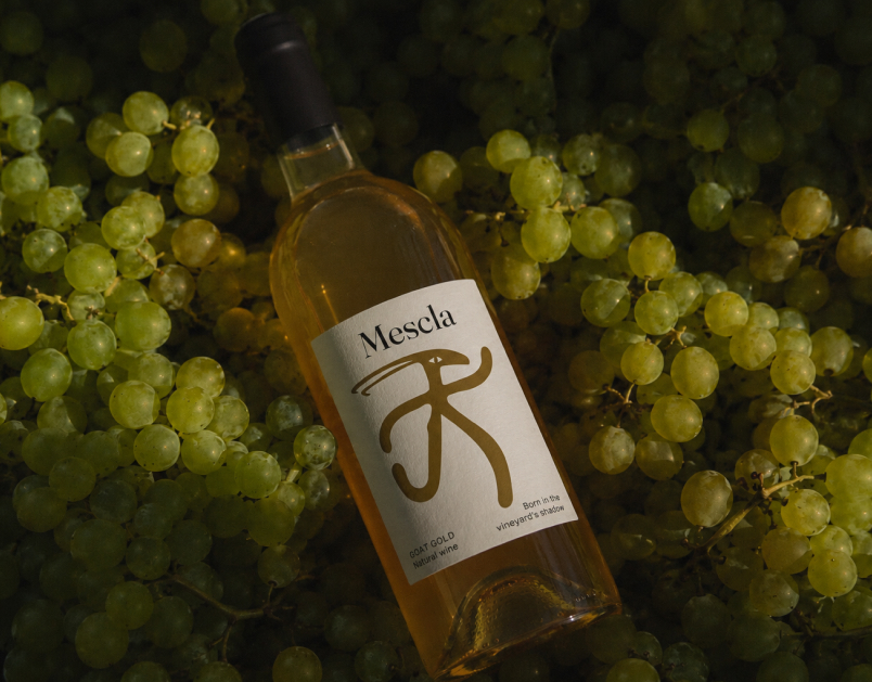
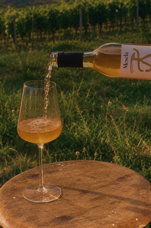
The final identity uses a single fluid, hand-drawn mark across a three-bottle range — Goat Red, Goat Gold, and Goat Bone — where only the accent color shifts to reflect each wine's character. The result is a natural wine brand that feels primal and instinctive, yet remains clean enough to stand confidently on a shelf.
Iskra
CONCEPT
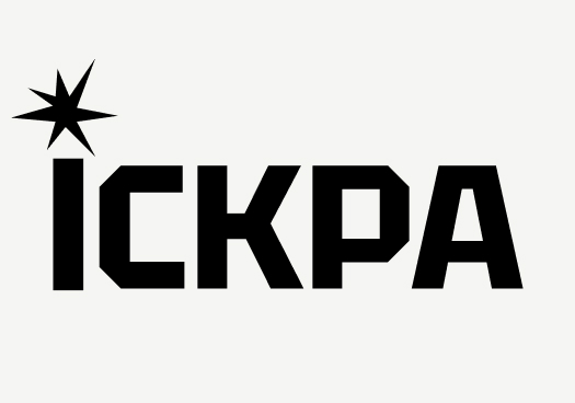
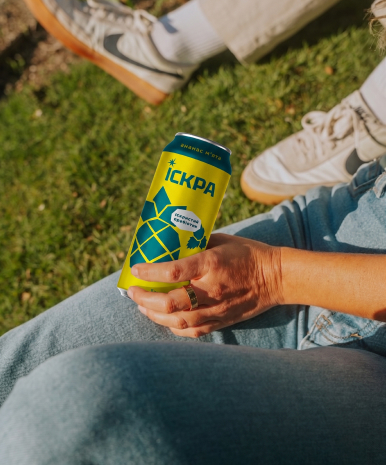
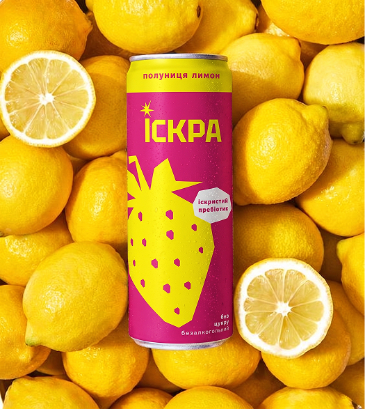
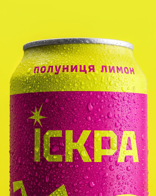
ISKRA is a prebiotic sparkling drink brand where health meets a bold, "acid" aesthetic. The name means "spark" — and the identity captures that energy through stylized geometric patterns and vibrant color, proving that sugar-free wellness can look as exciting as it feels.
CHALLENGE
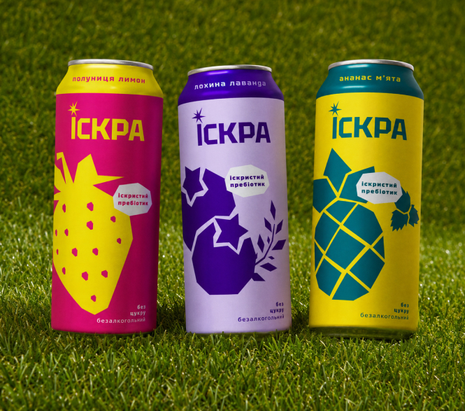
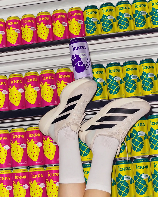
Sugar-free and prebiotic drinks often lean soft, clinical, or purely "healthy" in their branding — ISKRA needed to break that pattern without losing trust in the product itself. The challenge was building a system punchy enough to stand out on a shelf, while staying flexible across three very different flavors.
SOLUTION
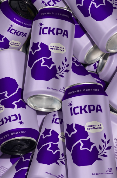
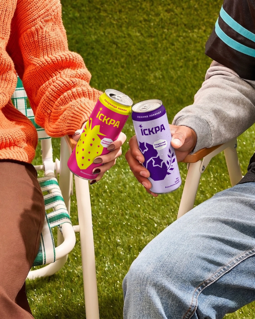
Each flavor gets its own faceted fruit illustration — strawberry-lemon, mint-pineapple, blueberry-lavender — built from sharp geometric shapes that echo the brand's spark motif. A bold color per can, a starburst mark, and confident type give ISKRA a shelf presence that feels energetic first, "healthy" second.
Rebro
CONCEPT
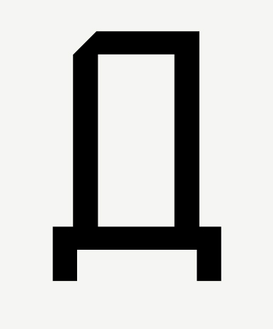
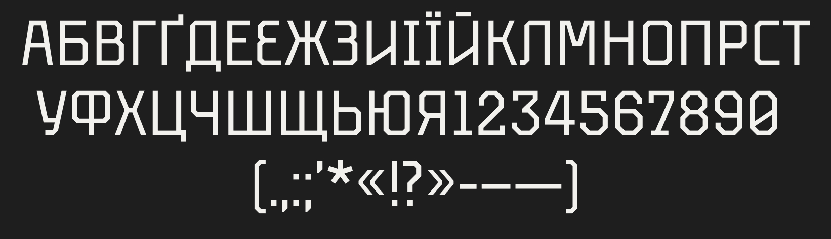
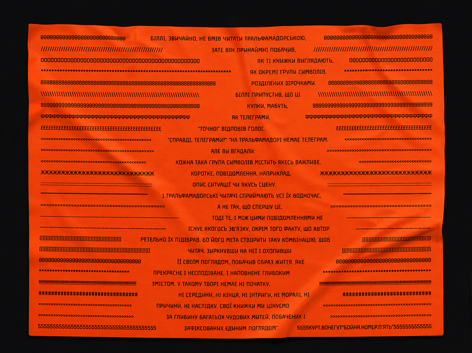
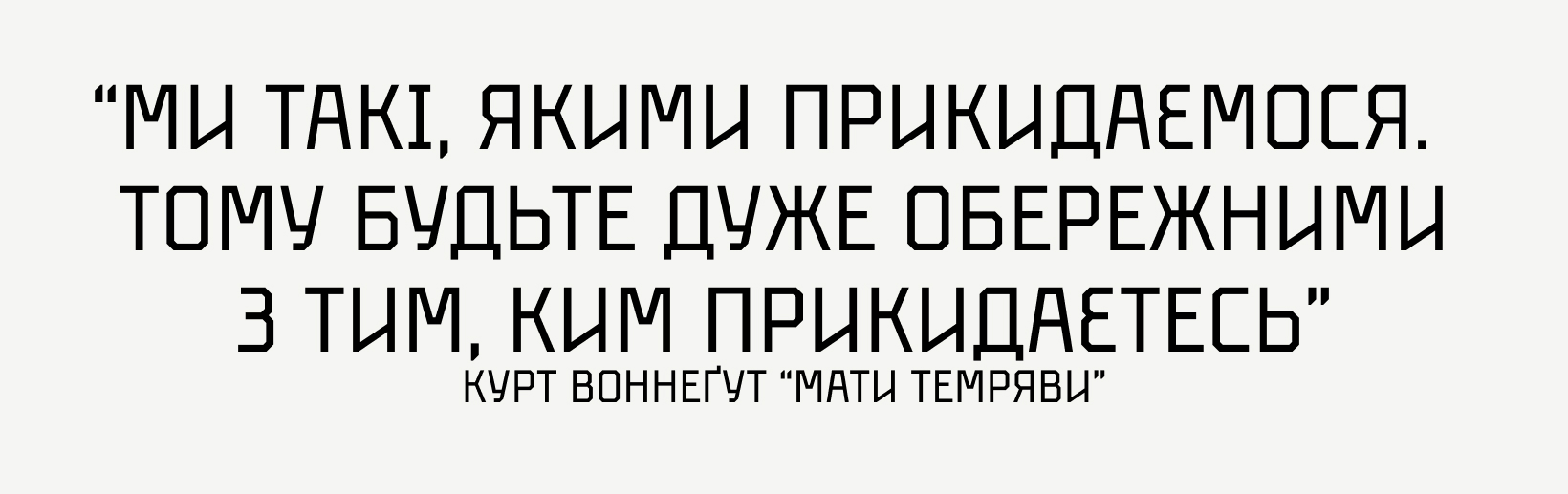
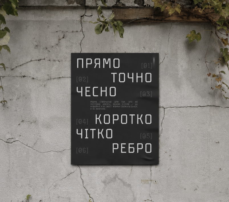
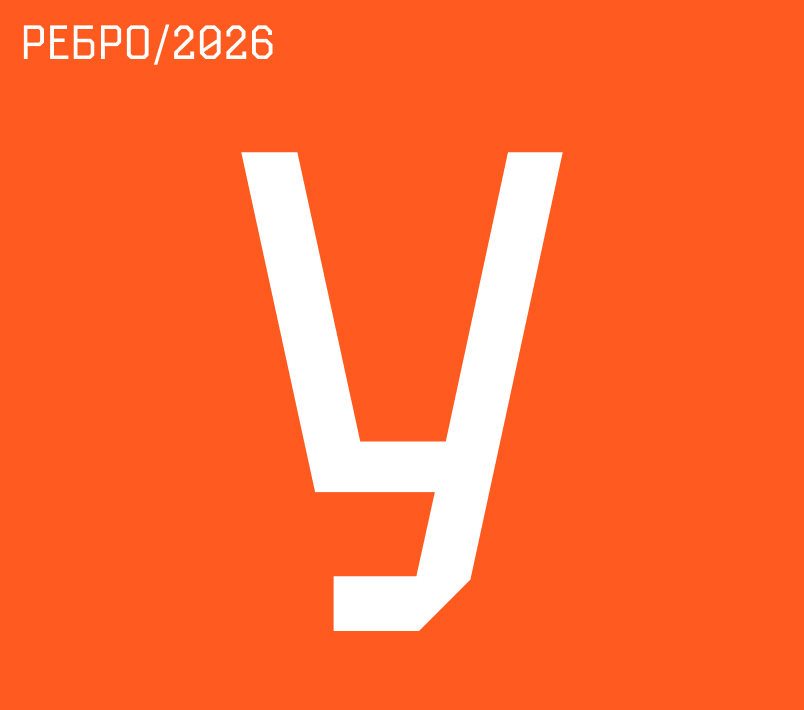
Rebro is a geometric grotesque — pragmatic, with a strong character. A typeface for those who want to speak direct. Its character is strict but not aggressive — more precise than harsh. Inspired by the aesthetics of industrial road signs, the clean lines of engineering drafts, early computer interfaces, and street lettering in general.
PURPOSE
Built for headlines, branding, and environments where clarity matters more than decoration — where the message needs to land without extra words getting in the way.
STATUS
Currently in progress, designed in FontLab. The uppercase letterset, numerals, and basic punctuation are complete. Lowercase letters are in development next.

GET IN TOUCH
/\_/\
( o.o )
> ^ <
/|   |\
(_|   |_)
d   b
Available for freelance projects, brand identities, and creative collaborations.
dariaprokuda2@gmail.com